
You ask an AI image tool for a social media poster and it comes back with lettering you love. Bold, consistent and nothing like the usual template look. Then you ask the obvious question: what font is that? And the tool has no real answer.
That happened to me recently. Here’s how I got from “nice poster” to a font I can type with, in about 30 seconds of actual work.
The short version
- AI image generators draw letters. They don’t use font files, so there is usually no “real” font to find.
- Asking the tool to name the font gets you a guess. In my case the guess was wrong.
- Asking for a font file may not work either, but asking for an alphabet sheet image usually does.
- A second AI tool, Claude in my case, turned that sheet into a working font in about 30 seconds.
- Test the result properly before it goes anywhere near your brand.
Why bother with a custom font at all?
Consistency. If you post every week, the thing people recognise first is the look, and lettering does most of the work. A poster that uses the same headline style every time looks like it came from one source. One that uses a different default font every time looks like it came from a template.
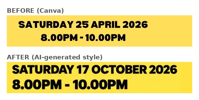
It’s also about time. I make a social poster most weeks to announce a guest. I’d already spent 20 minutes on a rough Canva version, and template tools have a habit of throwing the whole layout out whenever you swap an image. I wanted a look I could reuse without the wrestling.
How I did it, step by step
1. Start with your own rough design
I didn’t want a generic AI poster, so I gave ChatGPT a copy of my amateur Canva poster and asked it to make a better one. Giving it something to copy keeps the output closer to your brand than a blank prompt ever will.
2. Ask what the font is
The first part of the answer was honest: “The posters were created using AI image generation, so there isn’t an exact, identifiable font file.” It then suggested Anton for the big headline and Montserrat ExtraBold for the rest, and said that would be a very close match.
3. Check the suggestion yourself
I opened both fonts and compared them with the poster. Neither was close. Don’t skip this step, because a confident recommendation from a chatbot is still only a recommendation.

4. Ask for a font file
I asked ChatGPT for an .otf or .ttf. It couldn’t make one. It did offer something else, though.
5. Ask for an alphabet sheet instead
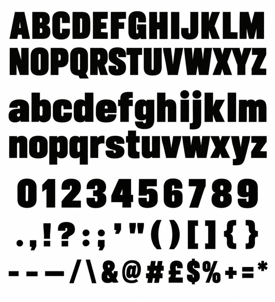
It offered a “custom alphabet sheet image”: every capital, lower case letter, number and common punctuation mark, set out in the same lettering. It was the same font as the poster, which is the important part. It’s still only a picture, but now it’s a picture of the whole character set.
6. Give the sheet to a tool that can build the font
I took the sheet to Claude and asked it to make me the font. About 30 seconds later, I had one. No issues.
Check it before you use it
“It worked” and “it’s ready for your brand” are different things. Before you rely on a font made this way:
- Type a real headline. Look at the spacing between letters. Pictures of letters don’t come with kerning, so some pairs may look too tight or too loose.
- Check every character you need. My sheet had capitals, lower case, numbers and basic punctuation, but no accented letters, and the hyphen, en dash and em dash looked almost identical. If your posts use £ signs, ampersands or foreign names, test those too.
- Keep it for headlines. A heavy display face is great at poster size and tiring in small body text. Pair it with a plain, readable font for everything else.
- Think about where it came from. If the AI was imitating a commercial typeface, your font may be a close lookalike of something you’d normally have to pay for. The legal position on AI-generated lettering is still unsettled in many places, so I’d use it for my own posters and not hand it out or sell it.
What I’d tell anyone trying this
Don’t wait for an AI image tool to hand you a usable font, because it can’t. Use it for the design, ask it for an alphabet sheet, and let a second tool do the font-making. The whole thing took far less time than the Canva poster I started with.
Got a poster style you’d like to reuse? Try the sheet trick on that, and test the result before you publish anything with it.